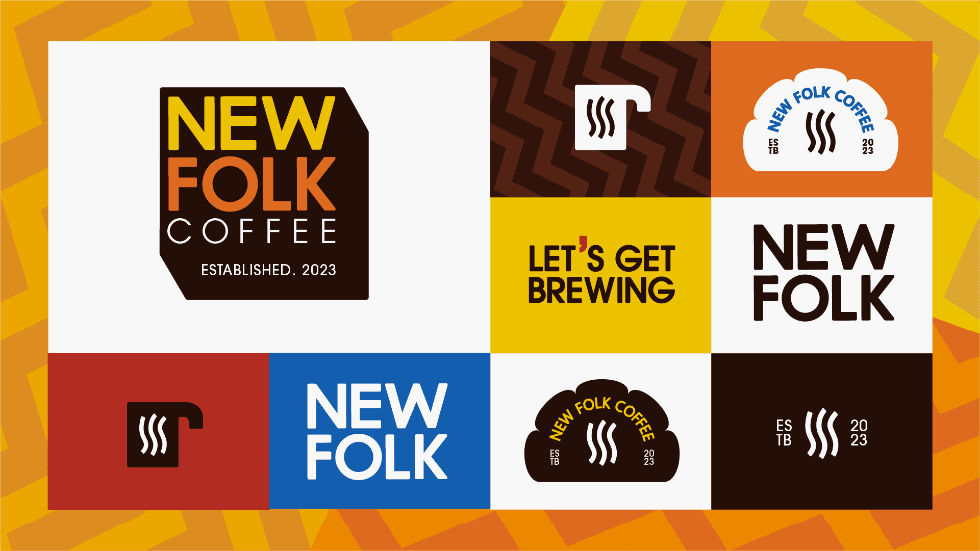
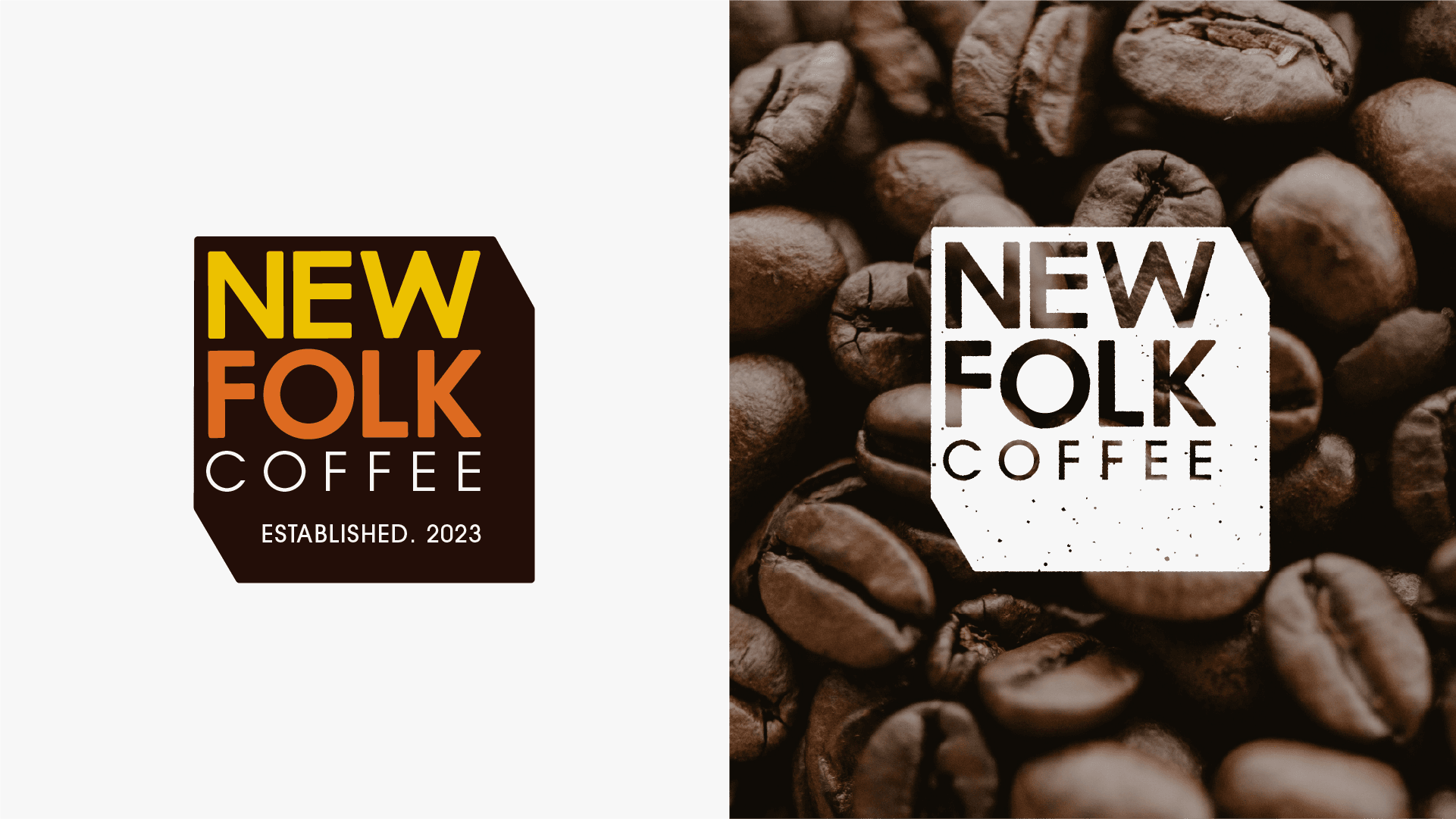
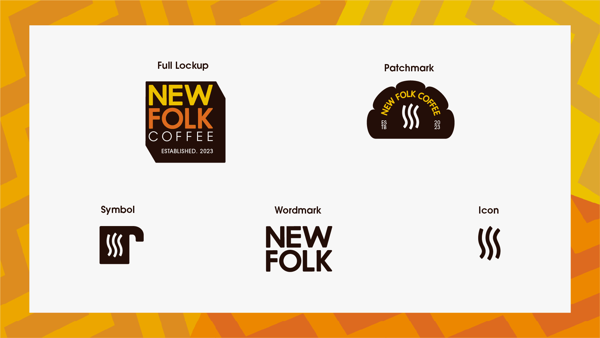
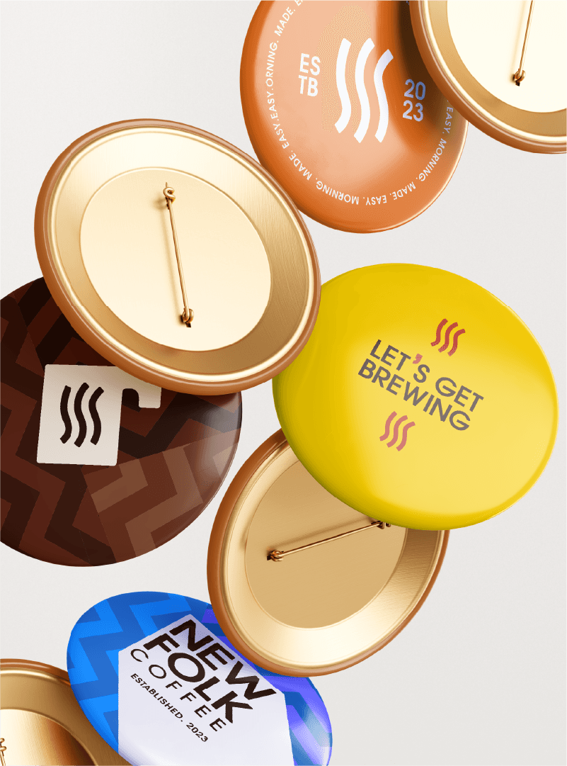
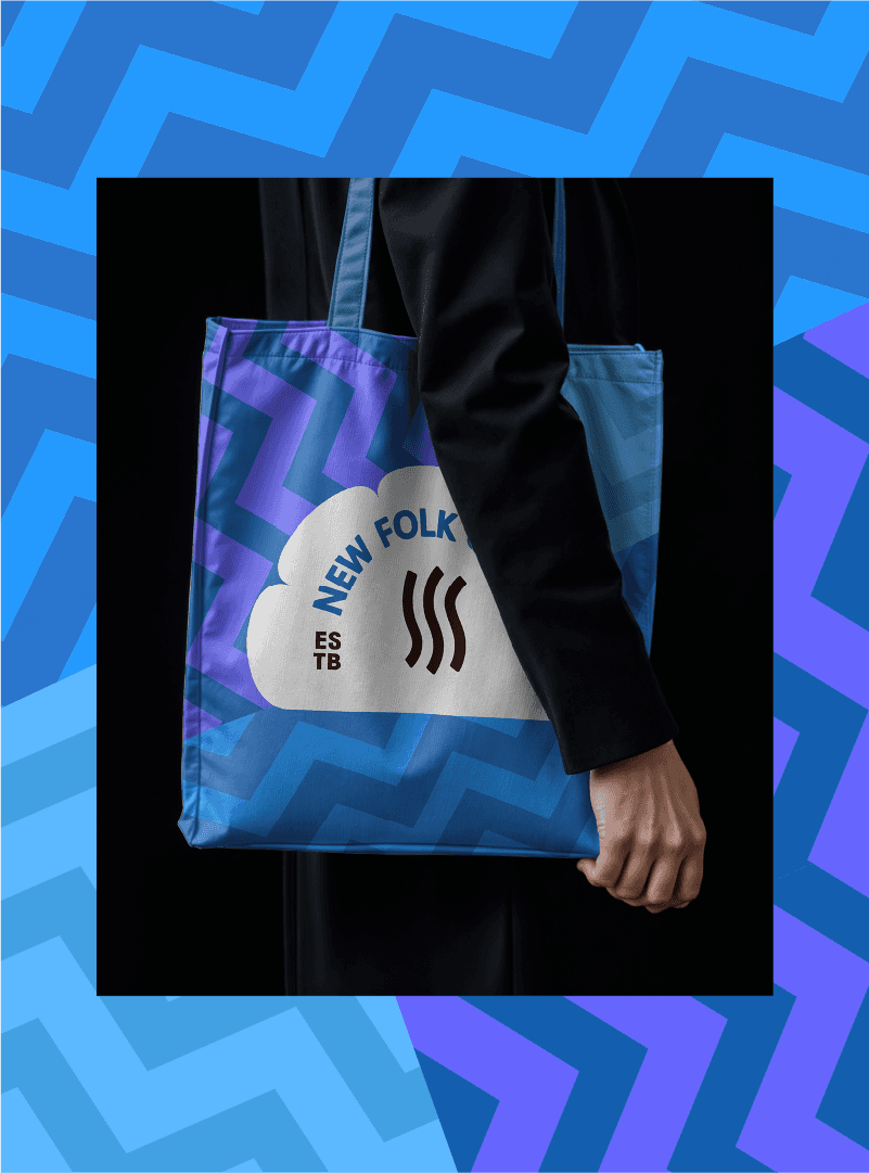
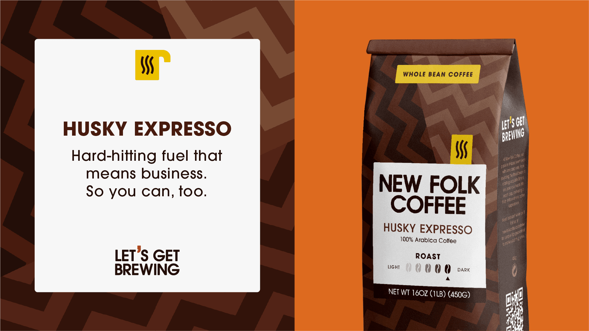
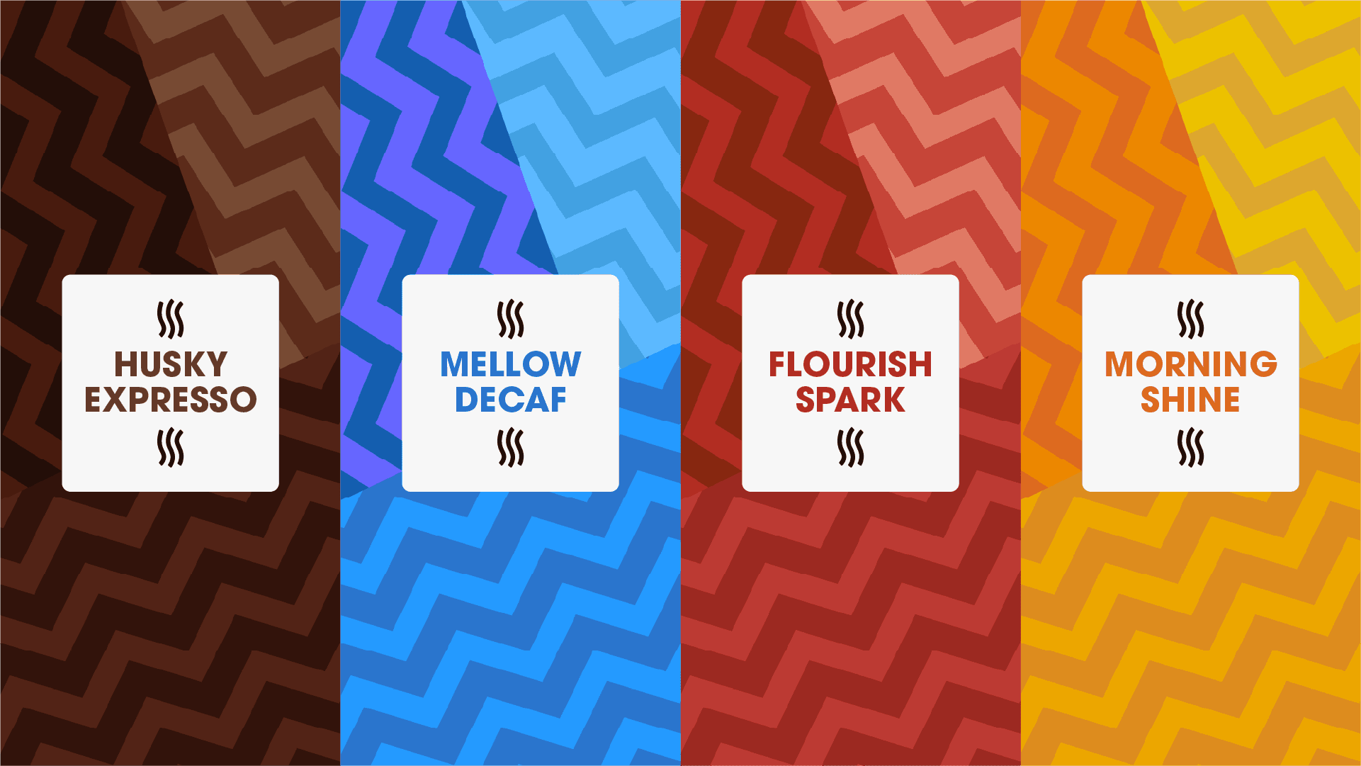
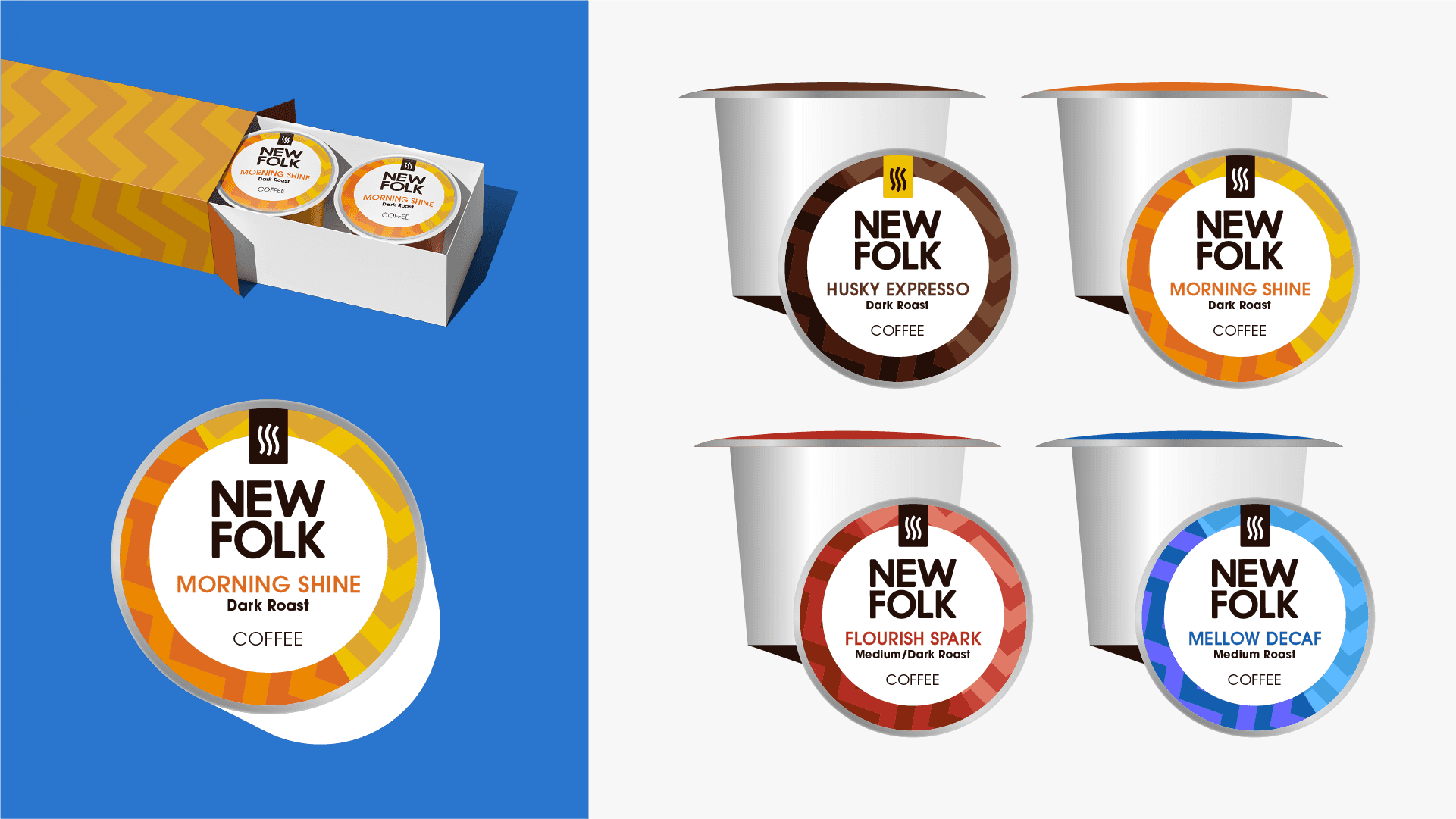
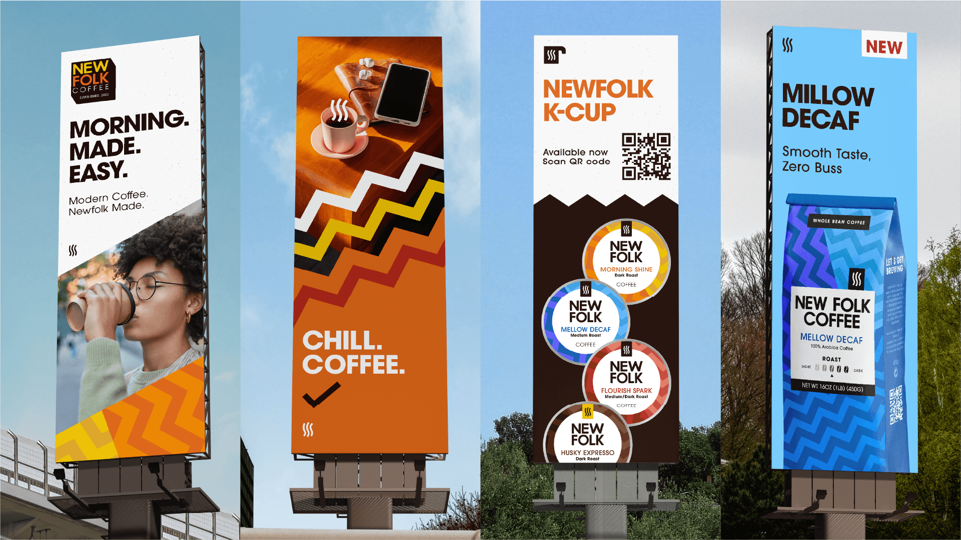
New Folk Coffee
In this case study, I’ll walk through my process of designing packaging for New Folk Coffee. The goal was to craft a bold, distinctive brand identity with a contemporary direction, helping it stand out in the competitive coffee market.
Conducting research
The design started with researching coffee brands that appeal to the modern generation, focusing on unique packaging that resonates with younger consumers. The goal was to create a fresh, engaging design with playful yet distinctive elements, making the packaging stand out and something consumers want to be part of.
Sketching exploration
I have explored a bunch of different logo styles that contain three main keyword, bold, clean and most classic minimalism,
Designing unique packaging
Based on research, I crafted patterns that combine a sharp, bold aesthetic with softer, more delicate elements. This balance of contrast not only adds visual interest but also ensures the design stands out and leaves a lasting impression.
Outcome
The final coffee packaging design successfully captures the attention of a bold, younger audience through its vibrant colors and dynamic layout. By deviating from traditional coffee packaging, its unique and playful aesthetic appeals to a modern demographic, positioning the brand as innovative and distinctive in the market.